You stare up towards the red light in rush hour traffic and your heart sinks. Can this be true? Do my eyes deceive me?
Peering down towards the dashboard, you see an unwelcomed warning: your gas tank is almost empty. With the needle on the gas gauge flirting with the letter “E,” you sigh and say to yourself “I guess it’s time to get some gas.”
Even before you make the decision to visit out of either necessity or convenience, a routine trip to the gas station doesn’t necessarily excite you. Filling up feels more like a chore, maybe even an afterthought. Most gas stations are built on efficiency; you simply pull in, fuel up, and get out. Even after you’ve left, there’s nothing enjoyable or particularly memorable about watching your pennies disappear one by one as you fill your tank.
Is there a reason why we don’t enjoy that trip to the gas station? Jakob Nielsen’s “10 Usability Heuristics for User Interface Design”1 may be able to uncover the answer.
The Psychology Behind the Gas Station Experience
You pull into the gas station and spy an open pump. You think, “Which side is my tank on again?” and pull in. You take your keys out of the ignition and get out of the car, the smell of gasoline perfuming the air. You quickly step out onto the pavement, avoiding spills, old gum, other miscellaneous trash, and approach the pump.
Though gas stations have existed since around 1913, the experience of pumping gas has only evolved ever so slightly. It wasn’t until 1947 that the first self-service gas station appeared in L.A., where station owners thought this idea would likely fail2. Even with today’s advances in technology, a visit to the gas station still forces users to exert extra effort, becoming something that disrupts their normal routine. The most successful user experiences do exactly the opposite: they tune into a user’s mental model, they don’t interrupt it. To quantify theories like these, Jakob Nielsen and Rolf Molich set out to develop a set of guidelines to help diagnose usability problems throughout user interfaces. They did so by factor analysis of 249 different usability problems, formulating ten suggestions to help designers create and identify better user experiences3.
So how does this antiquated experience stack up to the Nielsen Norman Group’s “10 Usability Heuristics for User Interface Design”? Let’s take a look:
1. Consistency & Standards
Users should not have to wonder whether different words, situations, or actions mean the same thing. Follow platform conventions.
Anyone who’s ever been to a gas station knows that their experience from gas station to gas station can differ greatly. “How many pumps are there? Which side do I have to pull-in to enter? Do I go inside to pay or can I pay at the pump?,” are valid questions a user not familiar with a particular gas station may have to answer even before pumping any gas.
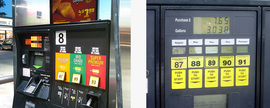
And once at the pump, these frustrating inconsistencies can also apply to the gas pump itself. Though different gas pumps appear visibly similar to one another, the way in which fuel pumps work can vary significantly. A different sequence of steps (i.e. “Do I pay or select the gas grade first?”), too little or too much feedback, and inconsistent button language all aide in the user’s’ confusion, creating an incredibly irritating experience for both novice and advanced users.
2. Flexibility & Efficiency of Use
Accelerators — unseen by the novice user — may often speed up the interaction for the expert user such that the system can cater to both inexperienced and experienced users. Allow users to tailor frequent actions.
To a user familiar with a specific gas station, procedural questions are usually answered with experience. Once you’ve been a few times, these steps become more memorable, and little or no assistance is usually required. Though this is the case for the advanced user, many novice users don’t quite know where to begin when pumping gas at an unfamiliar gas stations. Little hierarchy in instructions (or lack thereof) when visiting a pump for the first time only seems to create confusion around how a user performs the task at hand. “So, where do I begin?”
3. Recognition Rather than Recall
Minimize the user’s memory load by making objects, actions, and options visible. The user should not have to remember information from one part of the dialogue to another. Instructions for use of the system should be visible or easily retrievable whenever appropriate.
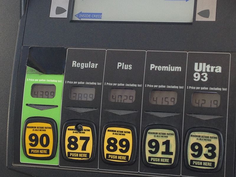
Even before fueling up, the user is asked to select a gas grade. This happens on the pump itself, yellow buttons with black writing illustrate different unleaded choices: regular, some sort of mid grade, and premium. These options are accompanied by large numbers representing the fuel’s octane rating; most patrons selecting the regular option often marked with the number 87. Other ratings ranging from 88-100 are sometimes offered, but these seemingly arbitrary numbers offer no meaning to the average user. Gas pumps themselves don’t provide any information regarding octane rating and engine performance, therefore the benefits to the novice user don’t always appear clear.
4. Match Between System & the Real World
The system should speak the users’ language, with words, phrases and concepts familiar to the user, rather than system-oriented terms. Follow real-world conventions, making information appear in a natural and logical order.
When at the pump, the user is left asking themselves, “Well, how much gas can I get for $25? Is that enough for me to top off my tank today?” The only way to find out is to either do a bit of math, or to just start pumping gas. Once the user begins pumping gas, one of the only signals that the tank is full is the audible “click” of the fuel nozzle. This usually comes without much warning; the sound of guzzling gas abruptly coming to a halt. This can prove to be incredibly frustrating for the user. Here, they feel like the fueling up experience is something out of their control.
5. Visibility of System Status
The system should always keep users informed about what is going on, through appropriate feedback within reasonable time.
When fueling up, users are provided with few sensory cues as to if their tank is properly filling up. Once the nozzle is placed inside the gas tank and the lever on the nozzle is squeezed, the user hears the rush of gasoline go from the fuel hose and into their tank. This feedback is also mirrored on the pump itself, this time on-screen. Here, the user will see both the gallons of gas and the dollar amount continue to rise until its completion. Other than the pictorial reference on the car dashboard gas gauge, the user has little reference as to how fast their tank is fueling, how much it will truly cost, and when it will stop.
6. Aesthetic & Minimalist Design
Dialogues should not contain information which is irrelevant or rarely needed. Every extra unit of information in a dialogue competes with the relevant units of information and diminishes their relative visibility.
At the gas pump, users are constantly being bombarded with new information. Things like advertisements, a multitude of gas grade options, strange smells and spills, and sometimes other patrons can leave a user’s attention divided. These elements can make even the most familiar users feel overwhelmed, leaving them to pay little attention to any on-screen guidance or instruction. And as for the novice user, this creates an even more frustrating scenario. With little feedback or constraints pointing the user in the proper direction, asking for help or clarification can feel like a daunting task.
7. Help Users Recognize, Diagnose, and Recover from Errors
Error messages should be expressed in plain language (no codes), precisely indicate the problem, and constructively suggest a solution.
“I can’t hear the gas pumping. Did I do something wrong?”
Nothing is more frustrating to a user than not knowing how to fix a problem. Users need reassurance when they’ve completed a task properly, but they especially need it when they’ve done something wrong. When a user performs an action, like pulling the lever on the fuel nozzle, they expect an almost immediate form of feedback or confirmation, like an immediate flow of gas into their tank. So when nothing happens and little feedback is given, it becomes difficult for the user to diagnose or even solve a problem they may be experiencing.
8. Help & Documentation
Even though it is better if the system can be used without documentation, it may be necessary to provide help and documentation. Any such information should be easy to search, focused on the user’s task, list concrete steps to be carried out, and not be too large.
Though most gas station patrons would rather not interact with a service attendant if they don’t have to, clear and effective help can become crucial when assistance is needed at the pump. Long lines inside the gas station often leave service attendants unavailable to leave their posts, causing frustration from both sides. The patron at the pump can’t get the proper assistance they need, while the other patrons in line are forced to wait for the service attendant.
9. User Control & Freedom
Users often choose system functions by mistake and will need a clearly marked “emergency exit” to leave the unwanted state without having to go through an extended dialogue. Support undo and redo.
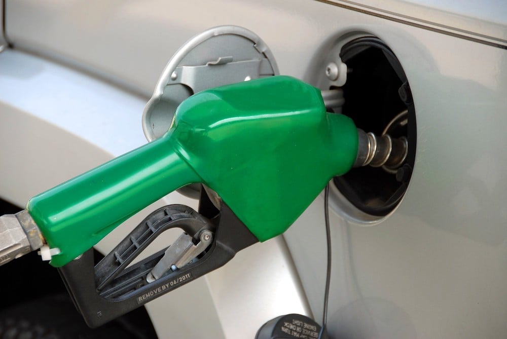
As a main touchpoint in the gas station experience, the fuel nozzle has only recently shifted from being controlled by an attendant to the patron. Because of this change, these rugged-industrial fuel nozzles have become a standard at the pump. Quite cumbersome to the average user, they’re usually heavy, unwieldy, and sometimes hard to even engage or control. These factors make it especially difficult to remain within a fixed dollar amount as users attempt to squeeze and release, squeeze and release, to get to the nearest even number on the display. Today’s fuel pumps don’t seem to provide users with enough control to be able to fine-tune what they’re spending at the pump.
10. Error Prevention
Even better than good error messages is a careful design which prevents a problem from occurring in the first place. Either eliminate error-prone conditions or check for them and present users with a confirmation option before they commit to the action.
When users do attempt to top off, rounding up to the nearest dollar amount, they’re actually doing a disservice to both their engine and wallet. When fuel nozzles audibly click off, signaling that the tank can no longer safely hold any more gas, this extra gasoline doesn’t actually make its way into the tank. The gas usually travels back into the fuel nozzle or hose, leaving a mess for the pump’s next patron. This misconception creates an error in which the user could’ve avoided through education or a more error-proof system.
Though Nielsen’s “10 Usability Heuristics for User Interface Design” aren’t carved in stone, these set of principles help designers think about the impact of their design. Analyzing the gas station experience can help provide useful tools in improving the gas station of the future. How could we utilize emerging technologies to improve the user experience of the gas station?
A Gas Station of the Future
With the rise of the new technologies and innovation within the car industry, the gas station of the future may look a little bit different. Today’s cars are driving farther and farther on less fuel; some cars don’t even run on gas at all. Ride-sharing companies, like Uber and Lyft, are truly revolutionizing the way we think about driving with their on-demand taxi services. So, how can the gas station evolve to compete with today’s advancements? What could that look like?
Today’s Possibilities
A smart, connected gas station experience is already within reach, simply by utilizing today’s existing technologies. ExxonMobil, for example, has been innovating at the pump since 1997, using RFID sensors to make paying at the pump easier than ever before. Their latest rendition has taken the shape of an app, speedpass+, allowing users to fuel up without fumbling with a credit card or cash using their smartphone device. Even while away from the pump, the Exxon Mobil app provides a platform where patrons can authorize payments, view a history of their transactions, and even earn rewards for using it. What if this sort of functionality could be at all gas stations? What kind of emerging technologies support this and make this experience even better?
In the Near Future
What if you didn’t even have to leave your vehicle to fuel up? Say you pull up to the pump and a camera reads your license plate, associating you (and maybe even your family members) to your account. You open the gas station app on your smartphone and authorize your transaction while robotic arms remove your gas cap for you. You select a gas grade from the app, select an amount you’d like to spend, and you select go, all from the driver’s seat. While you wait, you could view a history of what you’d previously paid at the pump, set a budget, or maybe even fine tune your fuel preferences to get the best mileage or performance out of your car.
Maybe this same gas station could provide alternatives: pumps for gasoline cars and charging stations for hybrid and electric vehicles. Gas stations could become more like malls, offering luxury retail options or restaurants to occupy patrons while their cars charge. More advanced stations could even offer pre-charged electric batteries to replace a patron’s dead one, a service that could potentially be done in minutes.
In the Distant Future
In the distant future, owning a car may mean you won’t even have to drive, let alone visit a gas station. Driverless cars could become the preferred method of transportation, the user shifting from the driver to the passenger. This dramatic shift could cause cars to become much more independent; an odd thought in comparison to today’s vehicles. Why should I visit the gas station if the car could just do it for me?
Maybe these driverless cars could fuel up when you’re asleep, driving to the nearest gas station on their own. Out shopping? Your car can drop you off, find its own spot to park, and return when you’re finished. Servicing your car could be as simple as that, too. Instead of taking your vehicle to the mechanic, the car can simply drive itself, a replacement arriving at your door before you can blink.
With Nielsen’s guidelines in mind, implementing these types of emerging technologies could help address the pitfalls of the current gas station experience. These advancements could dramatically change the way we think about fueling up, eliminating some of the many instances of user error. Though no matter how gas stations may evolve in the near or distant future, the next generation gas station will almost certainly have to adapt to meet the ever-changing demands of the user.
Tara Kovalik is a Designer in Digital Experience at Essential Design.
Essential Design is a leading Innovation Strategy & Design consultancy. We work across the healthcare, consumer, and commercial industries, helping our clients conceive and drive to market comprehensive digital, physical, and service experiences.
Sources:
1. Nielsen, J., and Molich, R. (1990). Heuristic evaluation of user interfaces, Proc. ACM CHI’90 Conf.(Seattle, WA, 1-5 April), 249-256. ; 2. American Oil & Gas Historical Society: First Gas Pump and Service Station Retrieved from http://aoghs.org/transportation/first-gas-pump-and-service-stations/ ; 3. Nielsen Norman Group: 10 Usability Heuristics for User Interface Design. Retrieved from https://www.nngroup.com/articles/ten-usability-heuristics/
Image Credits:
1. Maarten van den Heuval (August 21, 2016) Texaco 2. Bobak (September 3, 2006) Gas Station Pump Five Octane Ratings 3. Anthony Inswasty (7 July 2014) A Gas Pump, Jacksonville FL 4. 127driver (30 May 2014) Brighton, MI Sunoco Ethanol-Free Pump Options 5. [Video] 6. Paul Brennan. Pumping Gas