The always interesting mix of design and art of NYCxDesign and ICFF did not disappoint this year. Here are some of the color highlights.
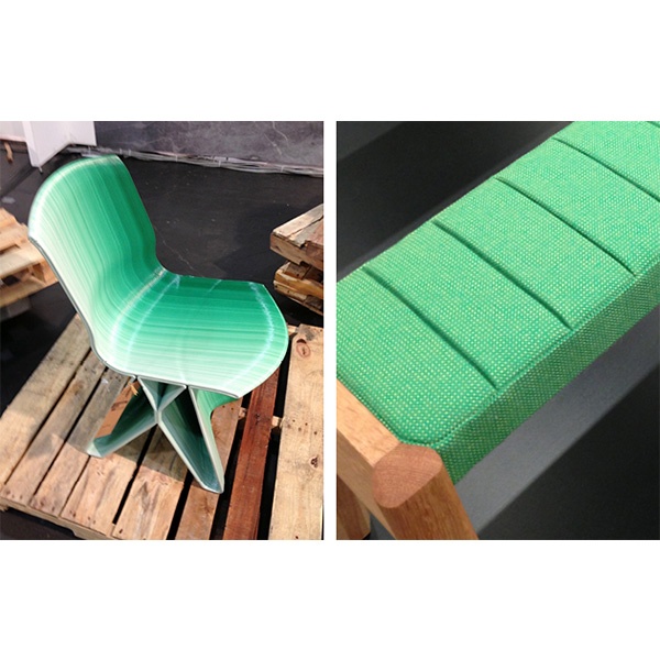
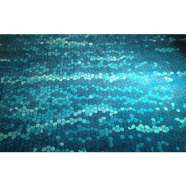 Turquoise and teal were all over NYC Design Week, which seemed like a fitting way to ring in the summer. This bright jolt of color is a nice contrast to all the gray monochromatic texture I was seeing. But emerald green proved to be the sleeper shade I haven’t been able to get out of my head since leaving. Especially mixed with the pale wood shades that are finally edging out the Walnuts.
 Texture! I don’t recall last years show being so texture-heavy, but it was a real standout this year.
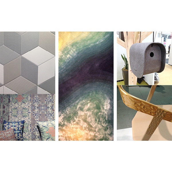 I felt like I was touching everything at the show. Subtle variations in texture proved to be a very strong draw, pulling me into booths just to analyze the surface treatment. I’ve never given much thought to the difference between silk and wool rugs until I saw Tsar use both on the same rug. The resulting texture change was both visually beautiful with the sheen of silk giving way to matte wool and a joy to touch. This discreet use of texture was mirrored in tile and wall coverings and even recreated in color with minor variations in hue.
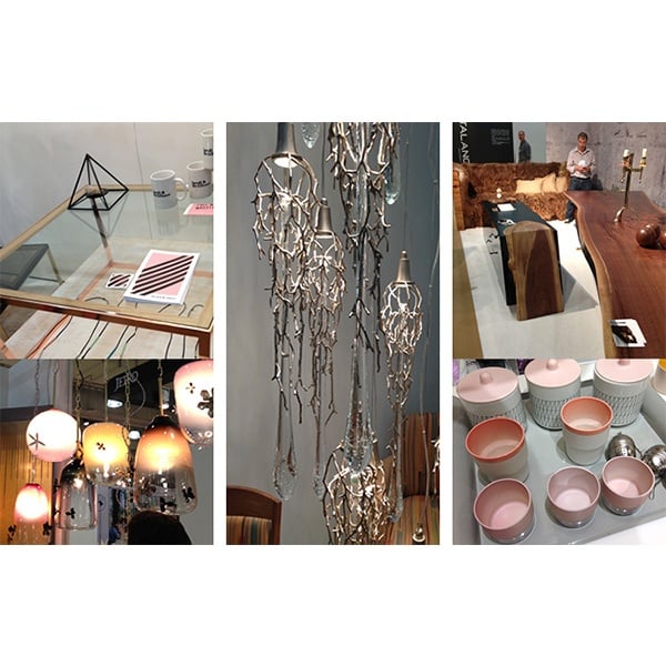 The surprising trend for me was the almost unapologetic decadence. Although I’ve been seeing warm metals trending strong for a while it seemed to skew to a more natural side. Here it was more the decadence of precious metal.
Stay tuned for my follow up post with all my favorites from the trip!