Hydrow (formerly CREW by True Rowing) has put together an extremely talented team of individuals to bring their vision to life and build a great company; our team at Essential was very excited to be chosen to help introduce a new form factor to the traditional rowing machine. Julianna Miller lead Essential’s Design team, including Taehak Kwon and Jason Cooper, to create what the Wall Street Journal says "would look as good on the water as in a living room". We sat down with her to get the inside story on how she and the team helped make this happen.
Fill us in: what’s the story behind CREW?“Hydrow was founded by Bruce Smith, someone who has an amazing passion for rowing and what it can offer - not only from a physical health standpoint but also from a mental standpoint: the beauty of being on the water, in nature, working with a team all while getting this amazing workout. He has such a pure love for the activity and wanted to share it with people, first with their app and then with the Hydrow, the first live outdoor reality (LOR)™ rower.
Where does a design firm come into this picture?
“Bruce (Founder and CEO of Hydrow) reached out to Essential because he had a focused vision for how the rower would perform and function (perfectly silent and having a live training portal). But that wasn’t all that he wanted. He wanted a design that was beautiful and timeless; something that would be a point of pride in people’s homes and that they would celebrate and leave out all the time.”

Bruce had a grand vision for Hydrow’s aesthetic: beautiful and timeless. But these words can be broadly interpreted. How did you translate these subjective ideas into something physical and specific to rowing?
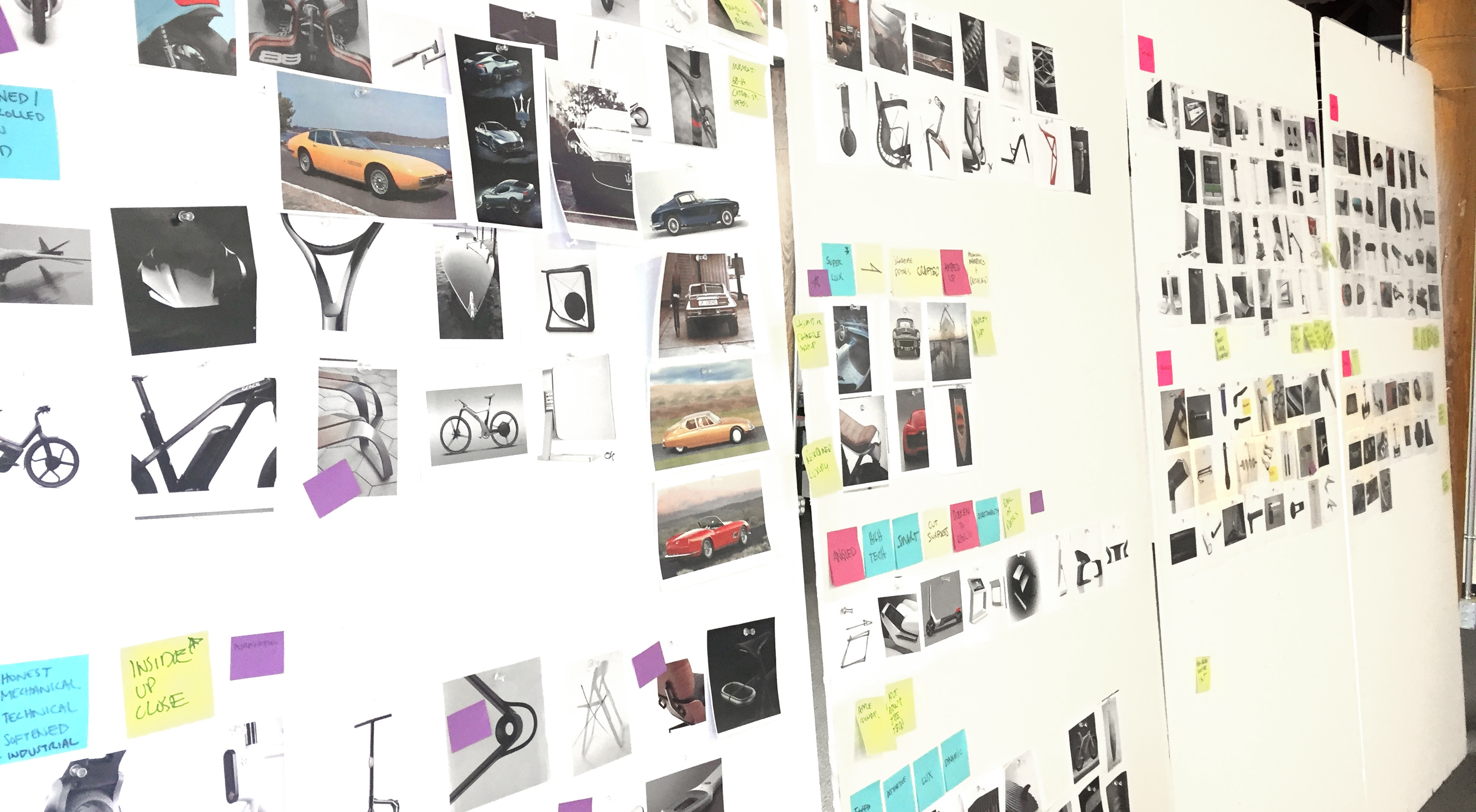
“So we started off by spending a lot of time really talking to Bruce- showing him lots of images and sketches. Just trying to understand what he meant when he said “beautiful and timeless.” We were really inspired by classic cars and classic furniture. Classic cars tend to embody so much more motion than modern cars do, and this idea of motion connected us to the water- to the actual experience we were trying to replicate. And then we looked at classic furniture because, at the end of the day, we wanted this machine to fit into your home. That inspiration connected us to what people found beautiful and what they would be proud to showcase.”

So classic cars and classic furniture were your design inspirations. But we know that design is more than form, and that it must function. What considerations did you need to make when designing something aesthetically beautiful that is able to function at a very high level?
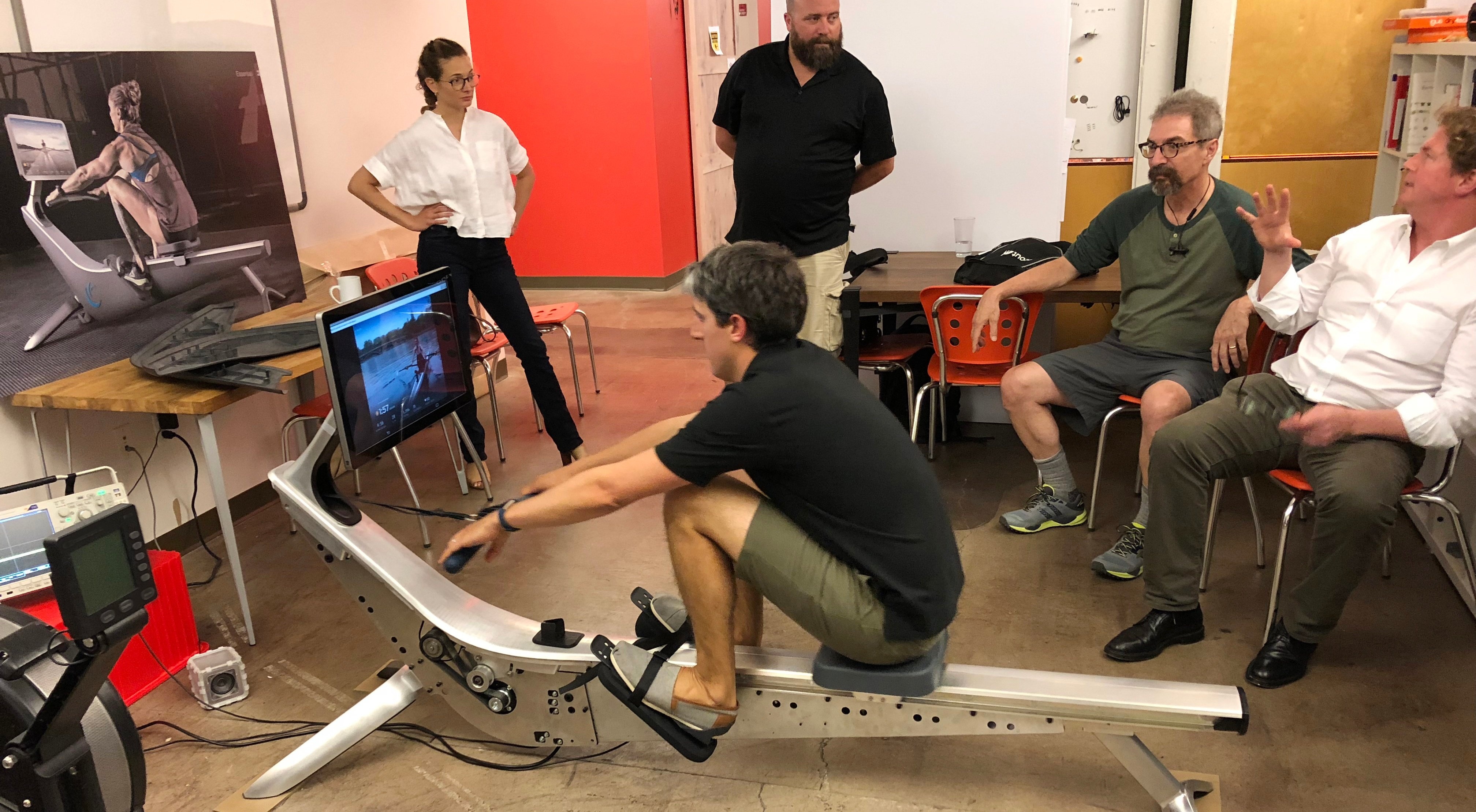
“Our process was definitely key to the success of the design. We started at the beginning with our friends at Cooper Perkins, who were developing the technology platform, so really the design was developed in tandem with the technology platform. And of course, Bruce, with his coaching expertise, was not going to let us fall short on the human factors. This really gave us the ultimate design freedom because we worked as a team to determine the defining design architecture”.
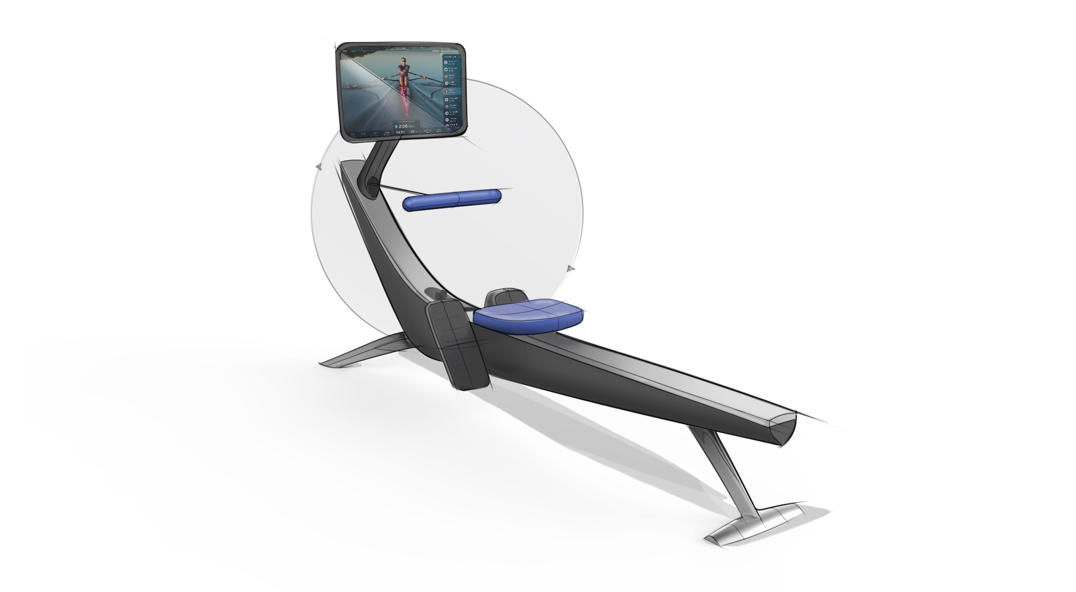
“One of the things that makes the design of Hydrow so unique is the clean, flowing top rail, made out of solid aluminum. When you look at most rowers on the market, the resistor is usually the dominant element. And we wanted to shift that user paradigm. Not because we weren’t proud how it functioned (the technical story here is just as great as the design story), but because the resistor wasn’t supposed to be the focal point for the user. We wanted to draw the user right to the screen, to the instructor and the beautiful environment that the classes take you to. So we used the flowing body to hide the resistor. It’s already quiet, you can’t hear it, so why do you need to be staring at it?
Once we integrated the resistor into the body the design started to evoke all these nautical references. You can start to see how this machine feels a little bit like a skull inland, but we didn’t want to be too literal with it. We wanted to capture the essence of the experience of being on the water but then be honest with it. It’s a machine that’s meant to live in your home, so the rest of the design fell into place thinking about the home and furniture design.”
How is this different from other rowing machines?
“It’s more authentic to the experience being on water. We didn’t want to do what all other exercise equipment does, which is to kind of celebrate and shout at you how it works and how it functions. But this machine is silent. It - the machine itself- is not meant to be the number one thing, it’s not how it works, it’s just that it works. And so through hiding that and bringing that inboard, the form starts to feel more authentic to the rowing experience. It almost seems like magic how it works because you don’t see this resistor. You can just be 100% focused on the instructor, just like how rowers on the water are completely in the moment. And after that it was just about bringing in all enough design cues to make it feel like it was meant to live in your home so that every single day you’re getting back on it”.

What was it like to work with Bruce and the rest of the CREW team?
“It was fast and it was awesome. There was so much energy. There was so much enthusiasm. It’s not every day that a client comes in and says to us they just want something beautiful and amazing. It was frictionless. We were aligning and agreeing on what is beautiful and amazing. It really did kind of become a passion project for everyone involved.
It sounds like an all-around really positive experience. What would you say was our team’s biggest win?
“Finding something that did not feel like a compromise for any party. A lot of times in product design you may have an aesthetic vision and desire, but there are always technical requirements that we have to work through, being able to work so closely with Bruce and Cooper Perkins, and actually bring that together was a big win. There doesn’t feel like a point where the design was suffering because of the technical needs. In fact, the technology embodiment really helped make the design.
One last question. Give us three words you would use to describe Hydrow’s design.
“Desirable. Sculptural. Elegant.”


