Corey Dinopoulos grew up in Dracut, Massachusetts and went to the Massachusetts College of Art & Design (MassArt) where he earned a BFA in Fine Arts with a concentration in Graphic Design. After focusing on print design, he shifted gears to digital design at Fidelity Investments and then at John Hancock before finally joining Essential's Digital Experience team. Along his journey, Corey has found unconventional ways of bringing his user experience perspective to complex challenges, including co-founding Boston's 2024 Olympic bid and campaigning for Boston City Council.
1. To start, you almost became a politician. What inspired you to run for office?
“Maybe I’m just a little bit crazy? I've been civically engaged in my community and always looking for ways to improve the City of Boston. Whether it's social events or community meetings, I'm always seeking opportunities that bring people together and constantly looking for inefficiencies in how we live work, and play within our city.
With a background in design, rather than law or public policy, my approach to solving problems comes with more empathy. As designers, we are constantly trying to solve problems and put ourselves in other’s shoes. I felt with my background in design that I would bring a refreshing new perspective to the council and to city government.
Lastly, in President Obama’s farewell address to the nation, he encouraged young people to lace up their shoes and do some organizing. He implored, “If you’re disappointed by your elected officials, grab a clipboard, get some signatures, and run for office yourself.” So that’s exactly what I did!”
2. Before getting into the digital space, you worked in graphic and print design. Tell us about some interesting projects you worked on and how you made that shift.
“With a degree in Graphic Design, I had many possible routes to take with my first career. I wasn’t sure if I wanted to work in-house on a design team or for an agency, but after attending a design lecture one summer, I learned of Sasaki, an architecture firm doing great work, and pursued joining their team. During my time there, I worked as an environmental graphic designer concerned with the visual aspects of wayfinding, communicating identity and information, and creating experiences that connect people to place.
My time at Sasaki got me thinking about systems design, which took me into the digital space. UX and UI design are very much like wayfinding, except you’re guiding a user through the digital space rather than physical. With just one year out of school, I along with many others fell victim to the recession. Without a job, I started saving money and realizing I needed a role that would keep me financially sound. An opportunity arose at Fidelity after a college professor connected me with the creative director there (also a MassArt grad), and I joined their growing user experience design team soon after. While at Fidelity, I smoothly made the transition from doing primarily print design to responsive web and app-based mobile design. I embraced the change!”
3. What did you do at Fidelity and John Hancock, and what was it like to work at such massive, global companies with Boston roots?
“While working at both Fidelity and John Hancock, I was a member of their in-house design teams. While they were both large, global companies, my experiences at each were quite different. Fidelity in 2008 had a growing user experience design team of nearly 100+ employees working on improving Fidelity.com, customer rep tools, and native apps for iPhone and Android. It was my first foray in corporate life but was a lot less painful than most designers would imagine a large corporation. For one, you had endless resources, and I always found ways to make the most mundane projects and tasks more creative. I was fortunate to work with fun and talented people that made it difficult for me to leave.
From Fidelity where I was coming from an enormous team, I made the leap to John Hancock where I helped build the user experience design team from the ground up. For more than two years, I was dedicated to improving both employee and client facing user experiences.”
4. What attracted you to Essential?
“I had attended a design open house at Essential back in 2017 and remembered having great conversations with designers. I was taken on a tour of the office and was envious of the non-corporate and deeply creative culture that Essential seemed to have. I also wanted to have the opportunity to work on a wide variety of project work to keep things fresh. Ultimately it was continued conversation with Margaret Jacobi, a Principal designer who I had worked with previously at Fidelity, that got me to apply.”
 Corey Dinopoulos (right) shaking hands with parade-goers as a Boston City Council candidate during Boston's Pride Parade (2017).
5. So you’re a senior Digital Experience (DX) designer on our team. Can you tell us about the work that you're doing now?
“Currently, I’m working on two projects: redesigning a financial web experience and prototyping a healthcare interface. On a day to day basis, I'm doing everything from wireframing to visual design to prototyping how users flow through a specific app and then testing that with end users to verify that it's a better experience from what they previously were using. I really enjoy consulting work here at Essential from my earlier in-house experiences because of the diversity of work and wide breadth of clients.”
6. How do you describe the difference between UX and UI?
“UX, or user experience, is the planning, the strategy, the research and the architecture of what you're going to build. UI is the user interface, and it's more of the look and feel, the visual aesthetics and the interactivity of a product. Both are crucial and work hand-in-hand with one another.
A lot of times when you're looking to hire a new designer, you really want them to have both UX and UI skills. But most times people are stronger in one more than the other. We call someone with both skills a “unicorn”. I would say I have a good balance between the two. I started off as a really strong UI designer because I prefer working on the visual aspects of a product. But at John Hancock when we had only a four-person team, we didn't have a UX specific person or someone to do research or wireframes so I started diving into the UX stuff pretty deeply on my own.”
Are you calling yourself a unicorn?
“Maybe!”
7. What do you read / listen to / visit / etc...to get inspired and stay current on design, business, politics, etc...that you would recommend?
“I typically start or end my day scanning design inspiration on my Muzli chrome extension. It’s a stream of design inspiration, news, and trends from sources like Dribbble, Mashable, Design Milk and TechCrunch. I also turn to Twitter for quick and digestible local and national news in addition to an occasional tweet about our inefficiencies of Boston’s public transit.”
8. What tools and programs do you like to use in your daily work?
“For the most part, I use Sketch and InVision day to day with an occasional need for Adobe Illustrator or Photoshop. Sketch is a great tool for creating a system of screens because it has a number of features and plugins that enable designers to work more efficiently, and export and prototype design systems.
Sketch allows you to sync your designs with a browser tool called InVision. Through InVision, I can interface with my clients and show them progress so they can contextually add comments at their leisure. Both programs complement each other so well that it reduces friction in the design process.”
9. Do you have any companies or brands that you admire for their UX or UI?
“I’m an Apple guy, but I have to say that Google is beginning to win me over more and more each day. I love Google’s design language and ease of use of their products and tools. Last year I tried trading in my iPhone for a Google Pixel, but Apple still is far ahead in providing a better user experience on a phone over android. I just wish they’d cool it on the pricing ;)
With tax season around the corner, I also love the TurboTax website. It’s simple, responsive and easy to use UI has transformed an overly-complex process into something much more delightful.”
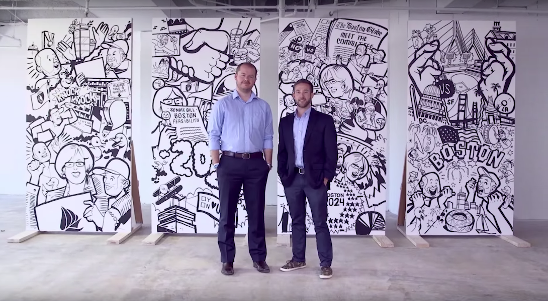
 Boston 2024 Olympic bid founders Eric Eddy (left) and Corey Dinopoulos (right).
10. You not only worked on Boston's Olympic bid but also were one of the founders of Boston 2024? Since hindsight is always 20/20, what do you think could have made the bid successful?
“It was spurred from my college thesis where I envisioned a future Olympic Games coming to Boston. The bid effort, started by myself and friend Eric Reddy, gained traction initially through a grassroots campaign of volunteers. Aided by Massachusetts Senator Eileen Donoghue, what was once merely a college project gained legitimate momentum. Most importantly, it caught the eye of powerful local business leaders, including Boston’s biggest construction magnate. Given Boston’s obsession with sports and technology, I felt like it would have been a great place to host an Olympics and be the model for a smarter, more sustainable Games.
Looking back, there are certainly a few things that could’ve made the bid more successful. To start, the U.S. Olympic Committee had sent a letter to 30 cities across the country gauging interest in a 2024 Summer Olympic Bid. The committee then asked Boston’s mayor to sign a formal agreement with them that banned city employees from criticizing Boston’s bid for the 2024 Summer Games, and also asked for bid-related activities to be kept confidential and away from public eye. Though the bid made it to the final four U.S. cities, it had been done without the proper engagement of the community. Because of the lack of transparency in the process, the residents of Boston and Massachusetts struck back.
If Boston’s bid had instead worked to improve the lives of residents in our Commonwealth, the outcome of the bid could have been different. The Olympics could have been an opportunity to revolutionize our aging public transit system and focus on the inefficiencies that keep Boston stuck in the past. Regardless of the outcome, it was an exciting experience that was started by two regular guys with a big idea. If it had kept that same grassroots spirit to the end, I believe it’s something that residents could have embraced. To learn more about the life and death of Boston 2024, you can read more about it here.”
Want to know more about Digital Experience design at Essential?


