It’s now easier and more affordable than ever to track our steps, heart rate, mileage, laps, sleep cycles or calories consumed while running, cycling, hiking, swimming, walking or working. In a market saturated with options, most people choose their device preference based on a combination of aesthetics and metrics it can track, but the app UX seems rarely considered in the equation.
While actual activity tracking occurs on the wearable device itself, all of the captured information is presented through a smartphone in an organized user interface – a set of graphs, stats and GPS coordinates. The quality of the device’s user experience depends in large part on what we see when the app is opened.
To find out which app does it best, I evaluated 4 of the top connected fitness tracker apps to see how their UX and UI stacked up: Apple Activity, Fitbit, Garmin Connect, and Withings Health Mate. I evaluated these apps across three key categories that define the connected fitness tracker experience: dashboard, single activity summary and overall data visualization.
Round One: Dashboard
The dashboard is the first screen we see when opening a tracking app. This screen typically displays a combination of current metrics tracked and past logged activities.
An effective dashboard should simplify a large amount of data into a “glanceable” overview that brings the most important information to the top, easy to view quickly. It should have a clear hierarchy of labels, stats, and easy-to-interpret graphs or visuals. A cohesive color palette and iconography are also important to consider, as they often work together to help users scan and associate information.
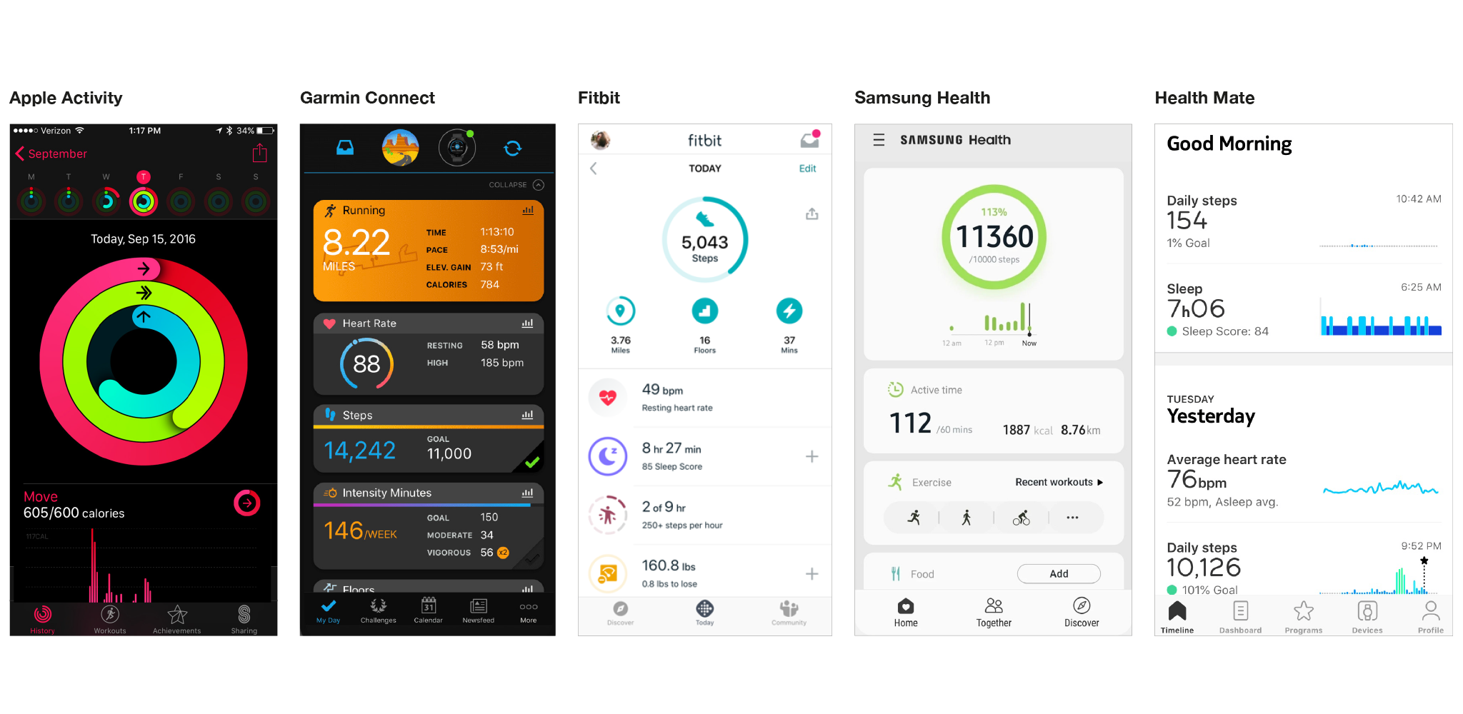
At first glance, Apple’s Activity dashboard catches my eye because of its bold colors and large, simple, easily recognizable infographic. The information is glanceable—you quickly are able to understand your daily activity, and a hint of an overview of your current week with a little more information about today’s activity. It’s a nice visual, but I’d prefer to see an overall summary one level higher than this. With all of the million things that my Apple Watch is tracking, I want to see all my stats!
Withings Health Mate and Garmin Connect both use a scrolling timeline structure for their dashboards. They split different metrics such as daily steps and average heart rate into “cards”. Health Mate relies mainly on the type of graph on each card to differentiate metrics, with little contrast elsewhere. I’d like to see more visual differentiation between metrics and for its typography to be pushed further with stronger weights, colors, or icons to make it easier to scan and see what I need to know. Otherwise, the layout is clean and without distraction, allowing the user to focus on the data splayed out on its elegant blue and green gradient graphs.
Garmin Connect does the opposite, with too many colors competing for attention on the dashboard, making it hard to know where to look and what is most important. The cards seem a bit crowded, and there are some redundancies that could be re-thought; for example, when a goal is completed, a full progress bar and a green checkmark at the bottom of the card create redundant signals that fill up valuable space.
However, Garmin’s individual activity cards (Running, shown in the above image) deserve a shout out—this is a really nice use of color, simplified statistics, and hierarchy of information. It gets extra points for using the GPS running route as a texture in the background. I’m such a fan!
Samsung Health and Fitbit are the last two contenders. Both of these dashboards have a top section summary followed by supplementary metrics and activities below. I like this organizational approach because you can see overall performance compared to set goals as well as individual metrics all in one screen. Between the two, Fitbit does it better, offering 4 customizable metrics at the top of the screen paired with a tasteful use of color, icons and typography for simple and easy-to-interpret data. All of this works together to make Fitbit’s dashboard my winner in this category.
Round 2: Activity Summary
This is the summary of a specific activity such as a run or a bike ride. When reviewing a summary screen, I’m looking for a simple overview of the type of activity, when and where it took place, and high level metrics relevant to that specific activity.
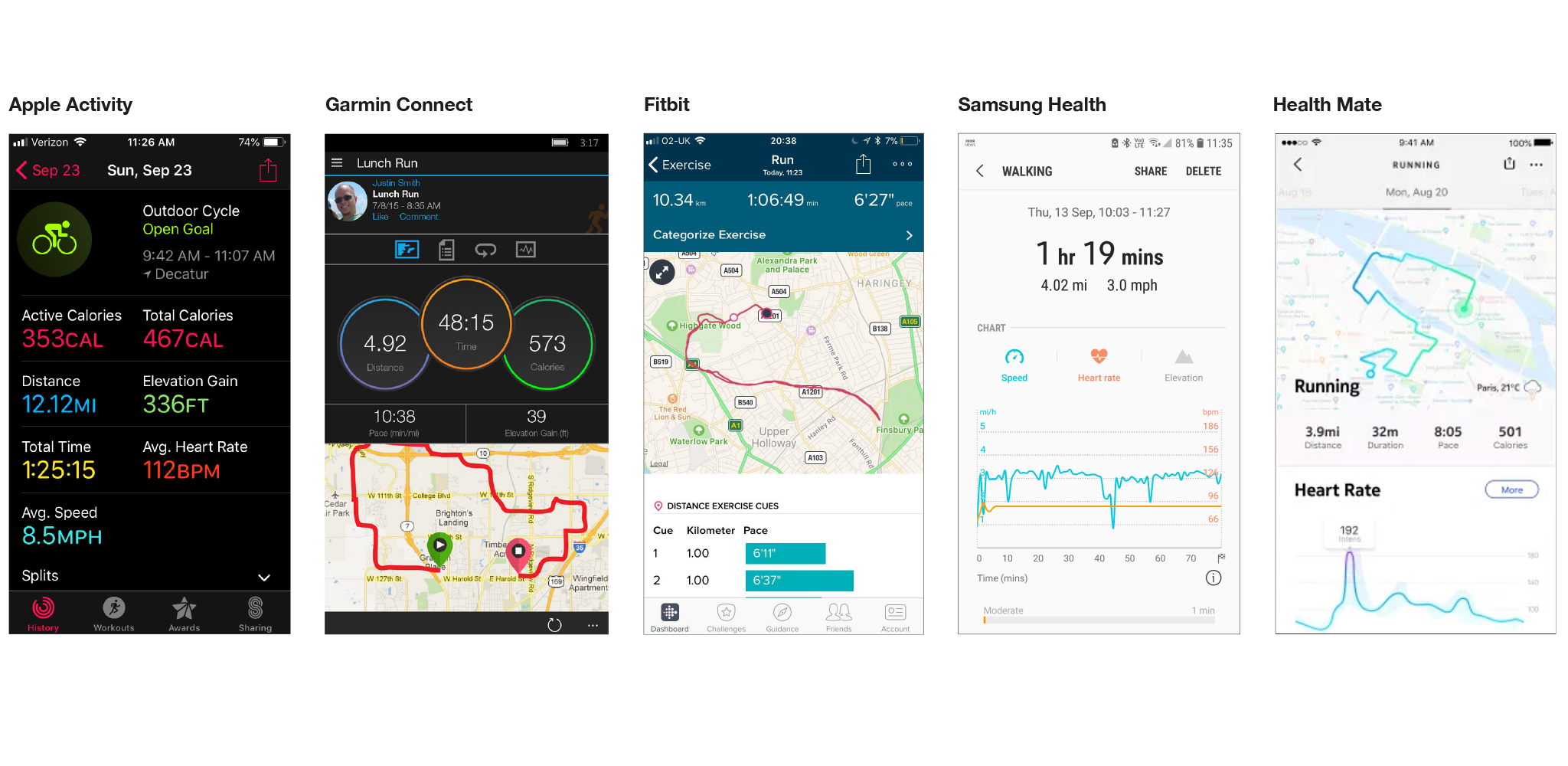
Apple’s summary has all kinds of problems for me. There is no real prioritization of data and all are displayed at once. You have to scroll down to see GPS map information, and what’s with all the different colors?!
Samsung: The hierarchy here is pretty good, I know where to look, and it’s nice to have metrics separated by speed, heart rate and elevation data tabs. The “chunking” of this data is organized thoughtfully and avoids overwhelming the user with too much to interpret at once, or creating a long, scrolling page. However, this doesn’t make up for the fact that this screen is so damn boring and uninspiring.
Garmin Connect: Generally, Garmin’s main summary screen shows a few key pieces of data and a GPS map of the activity. I like this approach, but there are some problems with the way Garmin organizes the page - there is so much wasted space in this screen. The title information of this activity is stacked with username and profile pic and options to like and comment on my own activity. At the very least, Garmin should have a different view for my personal activity vs. viewing someone else’s activity. Below, the general info is a tab system, similar to Samsung, that organizes the heaps of information that Garmin records. While this is helpful, it requires the user to hunt for the metrics they are most interested in. I’d really love to see Garmin put more effort into creating a custom summary for each activity that prioritizes the most important and relevant stats for each. Then the screen shows giant overlapping circles with three key metrics. Why are these circles, why are they overlapping, and what do the different colors mean?? I tried to figure out if the colors of the circles corresponded to certain measurements… but they don’t. There’s a lot to re-work here.
Fitbit prioritizes three metrics at the top and prioritizes the map of your activity, which is a nice hierarchy. This is then followed by split times, which I think could be replaced by a more interesting statistic like heart rate, elevation gain etc. Overall, this is a well-done and simple summary.
Health Mate: I love this summary. It shows the activity, the date, a small number of statistics to focus on, a beautiful, on-brand map that includes the weather and location, and a simple gradient graph of heart rate at the bottom that includes an annotation for the max effort point. I would like to see a little more accuracy in the points on the graph instead of the rounded corners style they have, but other than that small detail, this is all I want in a summary. Health Mate is my winner for the Activity Summary category.
Round 3: Overall Data visualization
When looking at the overall data visualization system, I’m looking for a consistent visualization language, meaningful and tasteful color use, appropriate graphs for the data they represent, clear hierarchy, and the general principle of taking complex data and making it simple.
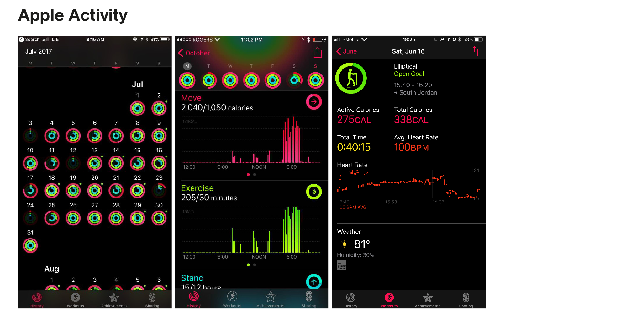
Right away, data shown on the dark interfaces looks fantastic. The contrast of dark backgrounds with the bright, poppy colors of both Apple Activity and Garmin Connect work really well to draw the eye in and focus on all that pretty data.
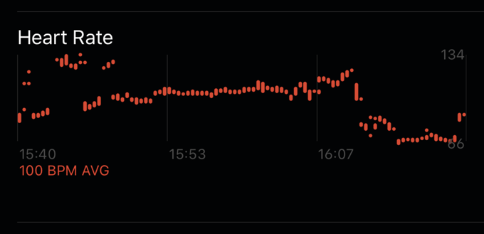
After looking a little closer at Apple Activity though, the choice of graphs isn’t very intuitive. For example, the heart rate graph maps sections of heart rate measured over time instead of an ongoing line graph. Not only is this difficult to read, but even when there is data for each moment in time, it still looks incomplete or like there are mistakes in the graph.
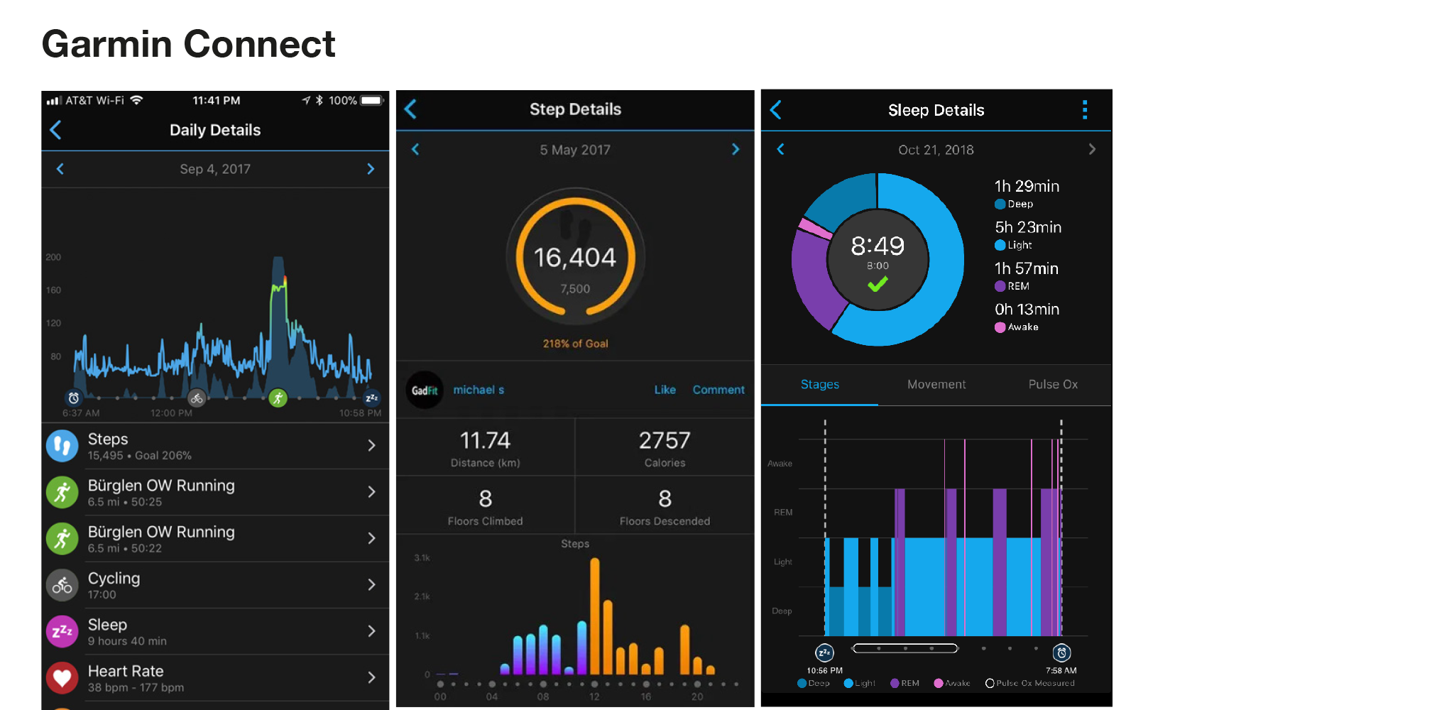
Garmin’s graphs do a better job relaying information that is easier to interpret, while looking really good doing it. I love the effort gradients and the way Garmin incorporate activities icons into the daily details graph. While the Garmin color palette is more muted than Apple, it communicates information well and is really well implemented.
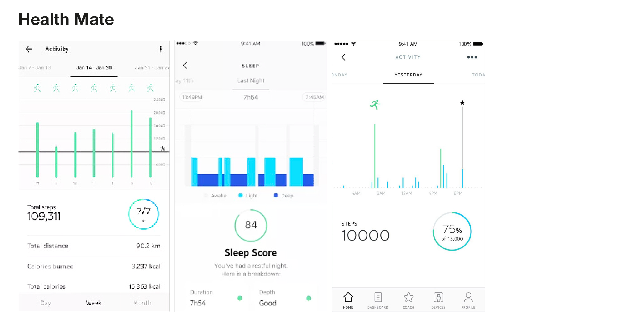
Health Mate has a really clean, consistent data layout. The top half of data screens prioritizes simple data graphs and uses the bottom half of the screen to show the most important metric accompanied by a goal ring showing where you stack up with your fitness goals. The use of whitespace and hierarchy is really successful, and though the typography can feel a little light at times, the lock up with consistent and elegant color treatment works well and always leaves the emphasis on the data.
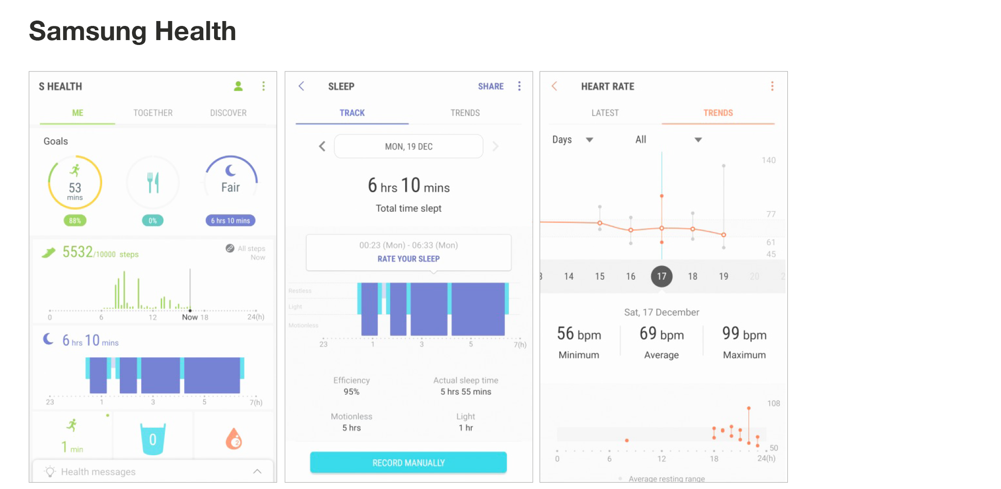
In Samsung Health, the data organization feels a little hectic. There is a lot that is trying to be displayed at once with lots of different signifying colors. Everything feels like it needs more breathing room and visual separation, as well as more prioritization to indicate what is most important. Samsung Health has some nice data graph styles, including a candlestick-like graph showing heart rate trends over time, but there are other decisions that seem less considered or intuitive (for instance, why is the sleep graph inverted?) Overall, the information display could generally be organized better to focus on a few key metrics with the ability to drill down into additional information.
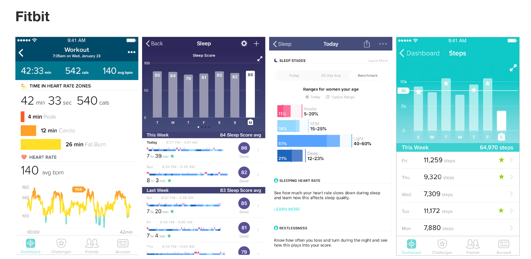
Fitbit has a nice data style that hits the middle of the spectrum. It has great hierarchy, intuitive graphics, aesthetic effort gradients, and appropriate graphs. My favorite part about Fitbit is that it goes the extra mile to provide more information about what the data is showing you. For example, it breaks down your heart rate graph into zones of peak, cardio and fat burn. There are a few metrics that could look a little more sophisticated, like the weekly steps view, but overall, information is easy to read, easy to understand, attractive, and well organized. Fitbit is the winner for this category, followed closely by Garmin for its simple and tasteful data display.
Overall
Each of these apps have their own strengths and weaknesses, but through my own exploration, I found that the user interface that does it best is Fitbit. Not only does it make data approachable and easy to understand, it does it in a manner that is consistent, friendly, and on-brand. The style of the data graphics is appropriate for the information and it provides just enough data to be useful and informative. Aside from the actual data side of it, Fitbit is one of the most robust tracker apps out there—with a built-in community, engaging challenges, workout videos and resources-- it even comes with a built-in food scanner to track the calories and nutrients of what you eat.
__________
Lauren Lu is a Senior Designer in Essential’s Digital Experience team.
Essential Design is a leading Innovation Strategy & Design consultancy. We work across the healthcare, consumer, and commercial industries, helping our clients conceive and drive to market comprehensive digital, physical, and service experiences.