Here are 9 product and service experiences the designers, researchers, and engineers on our team think are ripe for change.
Shortcoming Technology
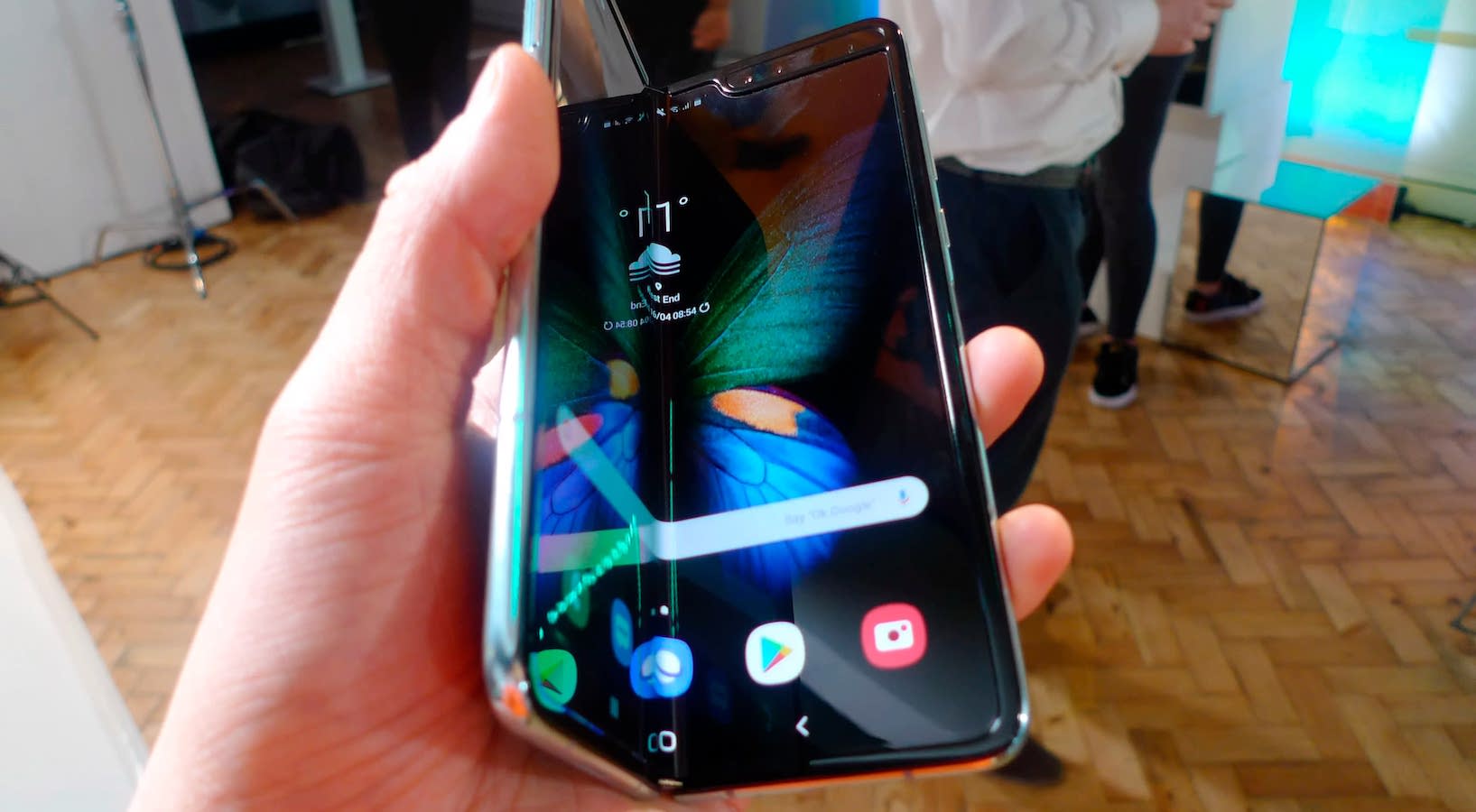 Samsung’s Galaxy Fold. (Source: Nikkei)
"...phones were breaking almost immediately."
“Something that immediately comes to mind is the whole Samsung Galaxy Fold debacle. It launched early and was immediately full of problems. Dust was getting into the hinge and behind the screen, displays were flickering, and peoples’ $2000 phones were breaking almost immediately. Samsung recalled the phones and tried again later, but it seems like the problem still isn’t entirely fixed. Foldable OLED displays are possibly the future of technology, but they’re not ready yet!”
- Graham Kelly, Senior Engineer
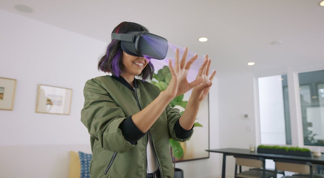 The Oculus Quest in action. (Source: Oculus)
"...I felt myself taken out of the experience..."
“I spent some time trying the Oculus Quest over the holidays. The graphics were excellent and the movements intuitive, but I felt myself taken out of the experience by the design of the headset. I would love to see Oculus work on a way to compensate for the front-heavy feel of the headset and find a better way to distribute the weight of it on the face. (My nephew would always come away with pink lines under his eyes from the way the headset sits. By redesigning the adjustment controls on the back to make it a more customized and well-distributed fit, users can focus more on enjoying the amazing VR experience.”
- Lauren Lu, Senior Designer
Outdated Product and Service Experiences
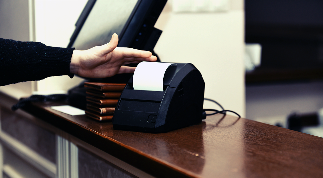 A restaurant worker is seen splitting one bill across multiple transactions.
"...it is time that a new standard is created for the restaurant industry."
“How frustrating is it to be handed a stack of 8 leather check presenters, 8 pens, and 24 separate slips of paper? It feels like a very outdated and inefficient way to handle splitting a bill at a restaurant. With services that make moving money around so easy nowadays (Venmo, etc.), it seems that it is time that a new standard is created for the restaurant industry. I have experienced some improvements at a few restaurants, with advances like handheld credit card readers that can split up a bill. Still, even those are often inefficient or at least not enjoyable to use. A streamlined product and experience in this space would be great for both customers and wait staff alike.”
- Peter McNulty, Senior Engineer
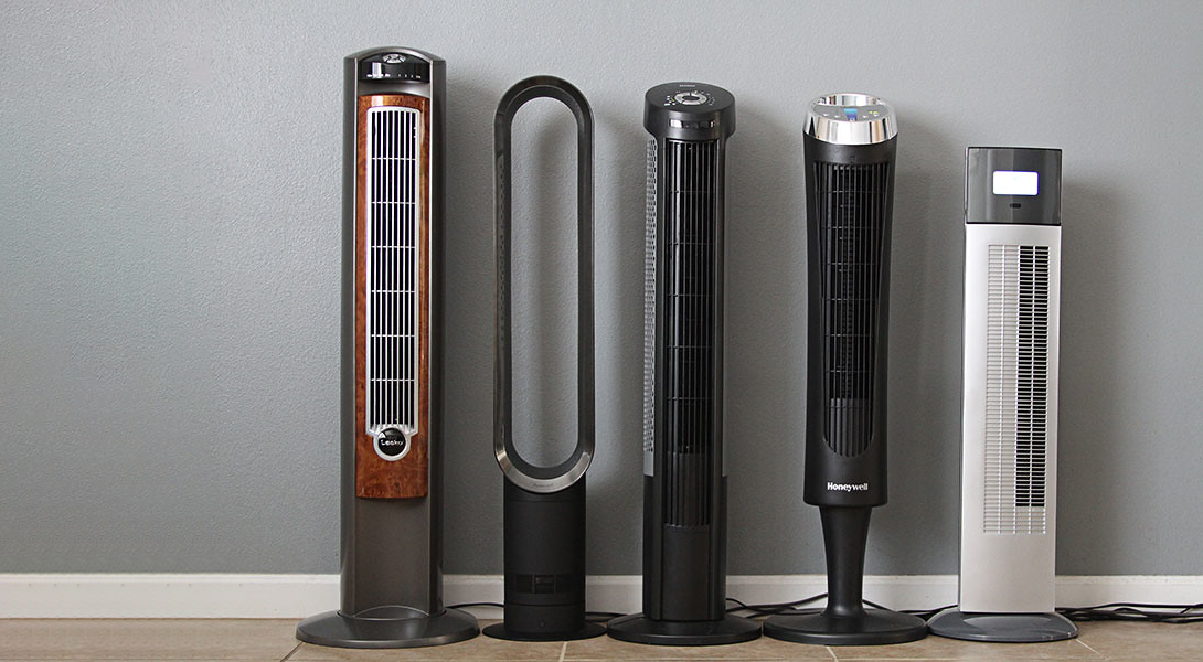 An assortment of tower fan designs. (Source: Your Best Digs)
"...they have no aesthetic appeal!"
“Tower fans. They’re functional and something I use every night for added white noise and a soft breeze, but they have no aesthetic appeal! They don’t “fit” anywhere in a bedroom without taking up a lot of space, and they add no visual interest. We put a lot of effort into the aesthetics of our bedrooms, spending hours deciding which throw pillows and curtains to buy, but then we just throw a big tower fan into the room that doesn’t look good at all. There has to be a way to make tower fans both functional and visually pleasing!”
- Annie Beier, Design Researcher
Unpredictable Delivery Services
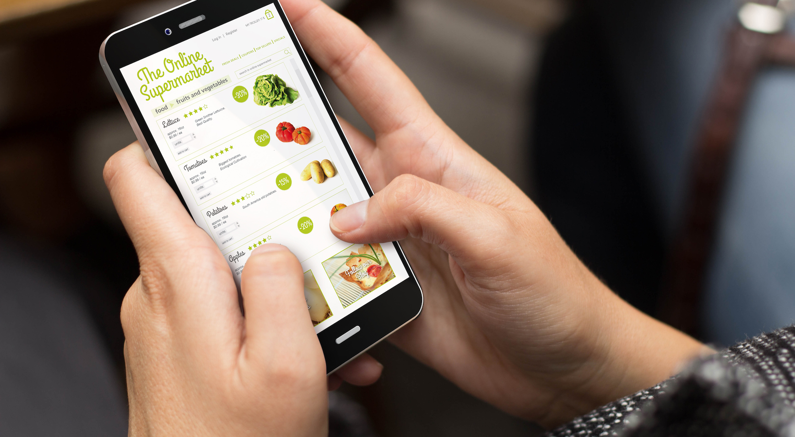 Grocery delivery services can be inefficient and unpredictable.
"It probably cost me more time than going to the store myself..."
“I tried grocery delivery for the first time last year (late to the game I know), and it was awful. The shopper didn't get half of my items, items that were listed online were out of stock, and I had to be glued to my phone to answer questions and be available for delivery. It probably cost me more time than going to the store myself, especially since I had to go to the store myself and get all the items that weren't purchased. As shoppers, we've also seen the in-person shopping experience at our local Whole Foods get more and more chaotic. I'm no longer dealing with everyday neighbors and the occasional strolling cart jam, but a hoard of professional shoppers with giant shopping carts and headphones clogging the aisles. Stores need to figure out a better way of meeting customer on-demand expectations than an army of 3rd party shoppers.”
- Juli Miller, Principal, Industrial Design
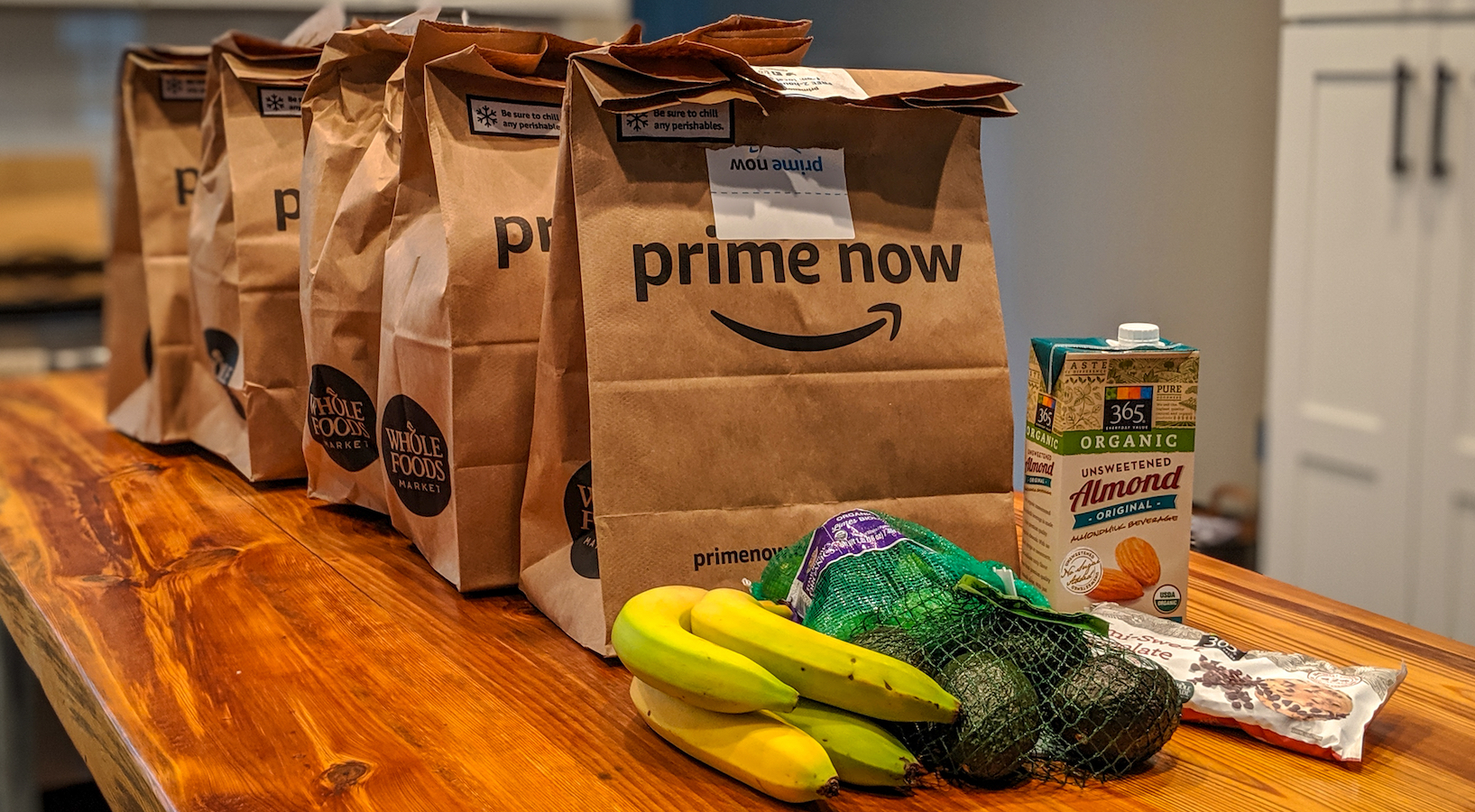 Amazon Whole Foods can be a frustrating experience from order to delivery.
"...every order brings a headache due to the clunky UX."
“Although Amazon Whole Foods delivers convenience, every order brings a headache due to clunky UX. When you open the app and navigate to Whole Foods, there’s an automatic QR pop-up meant for those trying to purchase in-store. Once you close out of that, you’re able to browse your favorite items, but you can’t consistently search for a new item. Often searches default to counterparts covered by “Prime.” I almost ended up with a case of seltzer instead of a 12-pack as a result! Things also break down during delivery. For the entirety of my delivery’s trip, I’m often “The Next Stop,” which can sometimes take up to two hours. Once the food arrives, I’m usually relieved to have skipped a trip to the grocery store… but the next time I order, the headaches start again!”
- Ali Cook, Innovation Strategy Consultant
Broken Transportation Systems
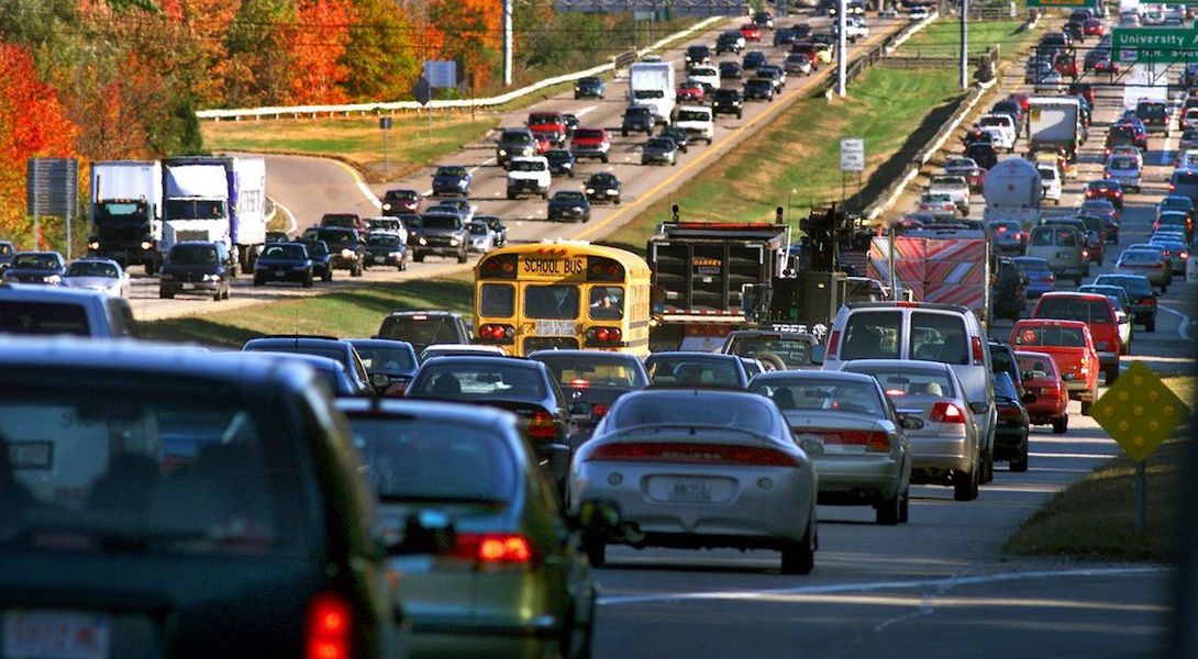 Gridlock seen at Boston's Braintree Split, the intersection of Interstate 93, U.S. Route 1 and Massachusetts Route 3 in Braintree, Massachusetts. (Source: The Boston Globe)
"Boston's transport system needs to be completely rethought..."
“Living in the Boston suburbs and working in the city, the cadence of my daily life is heavily dictated by Boston traffic. Boston’s transport system needs to be completely rethought, redesigned and reengineered to function at the level that our economy demands – our highways have traffic jams at every hour of the day, and the Southeast Expressway, Route 3 and the Braintree Split have been the bane of my existence for many years now. The MBTA is not an alternative – it is not dependable and costs a fortune to ride daily. The Green Line is a quaint old tourist attraction, not a mass transit system capable of functioning reliably in the 2020s.”
- David Knies, Chief Growth Officer
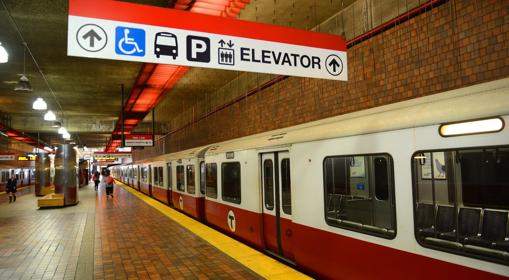 A train on the Red Line of Boston's public transportation service, the Massachusetts Bay Transportation Authority, or MBTA.
"...the MBTA became an integral part of my daily routine."
“Coming from midwestern suburbia, I had little experience with public transportation systems. When I started working at Essential, commuting on the MBTA (Boston’s public transport system) became an integral part of my daily routine. At first, I found it incredible that I could so easily access the entire city. Now, as the newness fades, I begin to see such potential for improvement! A technological update, consistency between lines, and some thoughtful wayfinding design would go a long way to improve the MBTA!”
- Katie Schussheim, Design Researcher
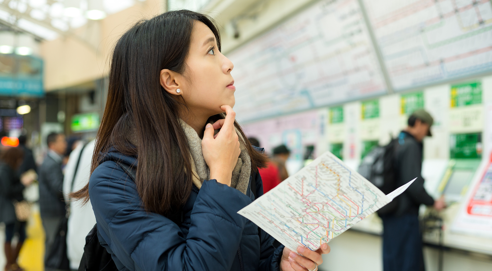 Public transit systems need to accommodate a range of rider needs.
"...the ideal system is designed for both tourists [and] commuters..."
“I’ve always found public transit systems really fascinating, and would love to redesign one. I don’t pretend to have the magic answers to how (I’d want to do a bunch of research first!), but I’ve thought a lot about how the ideal system is designed for both tourists who have never used the system and don’t know the city, and commuters who use it every day and know where things are. And I’m guessing that the system usage data, ideally broken down by station and time of day/week, would be a gold mine of cool insights!”
- Erin Mahoney, Design Researcher
What do you think? What product or experience would you love to redesign? How would you fix it?


