Brown-Forman is one of the largest American-owned spirits and wine companies and among the top 10 largest global spirits companies. They have more than 25 brands in its wines and spirits portfolio, including Woodford Reserve – a super-premium, small batch bourbon that is a product of the historic Woodford Reserve Distillery, located in the heart of Kentucky’s Bluegrass Region. Woodford Reserve has quickly become a highly acclaimed, award winning bourbon and as a category has seen significant growth.
In response Brown-Forman engaged Essential alongside our friends at Catapult Thinking to build a more robust brand and product design strategy for their Woodford Reserve brand and create a cohesive design language.The combined goal was to create more differentiation amongst Woodford Reserve’s growing product offerings and allow for future portfolio expansion.

Although groundbreaking when it first launched, the minimally adorned Distiller’s Select packaging had lost its uniqueness as the bourbon category grew in recent years. The elegant design that once defined Woodford Reserve had become the norm as more and more distilleries entered the market. Leveraging our experience in design strategy, we approached the project as a design language and set out to extend the existing brand legacy into a more robust product family that would continue to stand the test of time. With this approach, new products and structures could be introduced yet always seem like they belonged alongside the classic Distiller’s Select on a store shelf.
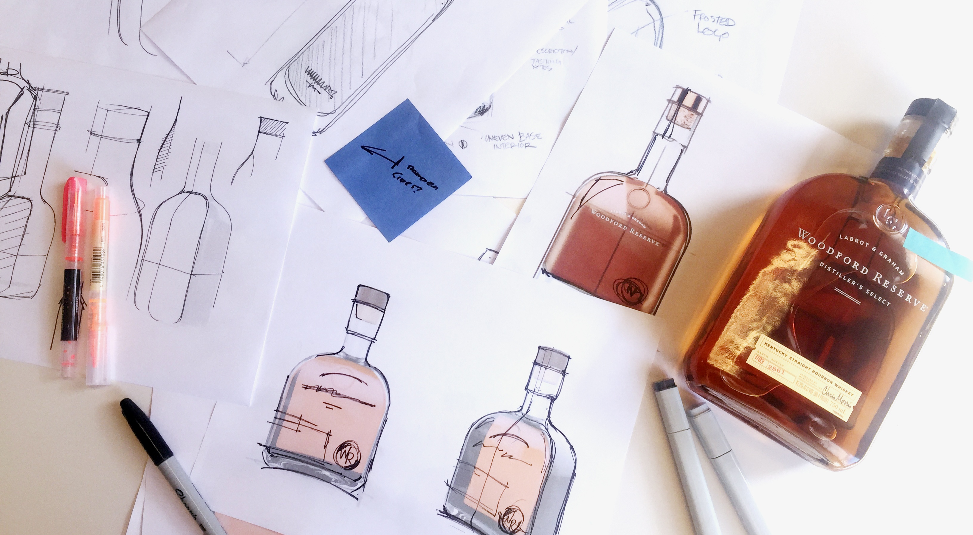
Because the original Distiller’s Select structure was still much loved, our challenge was to revitalize the original structures and extend the existing design equity. The original Woodford Reserve structure was known for its thin flask inspired profile, elongated neck, and its classic rounded shoulders stamped with the Labrot & Graham emblem. In our design exploration, we pushed these elements as far as we could without breaking the core brand recognition. In the end, this amounted to a subtle refresh for the classic structure but introduced entirely new structures for future product offerings. The first of which is the new Double Oaked bottle, which echoes the traditional shoulders and square geometry of the original, but plays with the proportions. The deeper body brings out the rich amber color of the whiskey, showcasing the quality of the unique double-barreled maturation process. As a parting signature, the redesigned Woodford Reserve mark embosses the lower corner.
As we built a stronger family for Woodford Reserve, the evolution needed for the original Distiller’s Select structure, became more apparent. The subtle evolution was no longer being driven by manufacturing constraints or arbitrary creative designs but instead served to strengthen the whole family. With small but significant adjustments to the overall proportions and redesigned trade dress from our friends at Studio MPLS, Distiller’s Select has strengthened its place in the premium whisky market.
Many thanks to our friends at Brown-Forman for bringing us into such an exciting category and for entrusting us with their much-loved bottle, the brilliant brains at Catapult for the strong brand positioning and our new friends at Studio MPLS for adding the sophisticated final touches.
Julianna Miller is a Senior Designer in Industrial Design at Essential Design.
Essential Design is a leading Innovation Strategy & Design consultancy. We work across the healthcare, consumer, and commercial industries, helping our clients conceive and drive to market comprehensive digital, physical, and service experiences.


